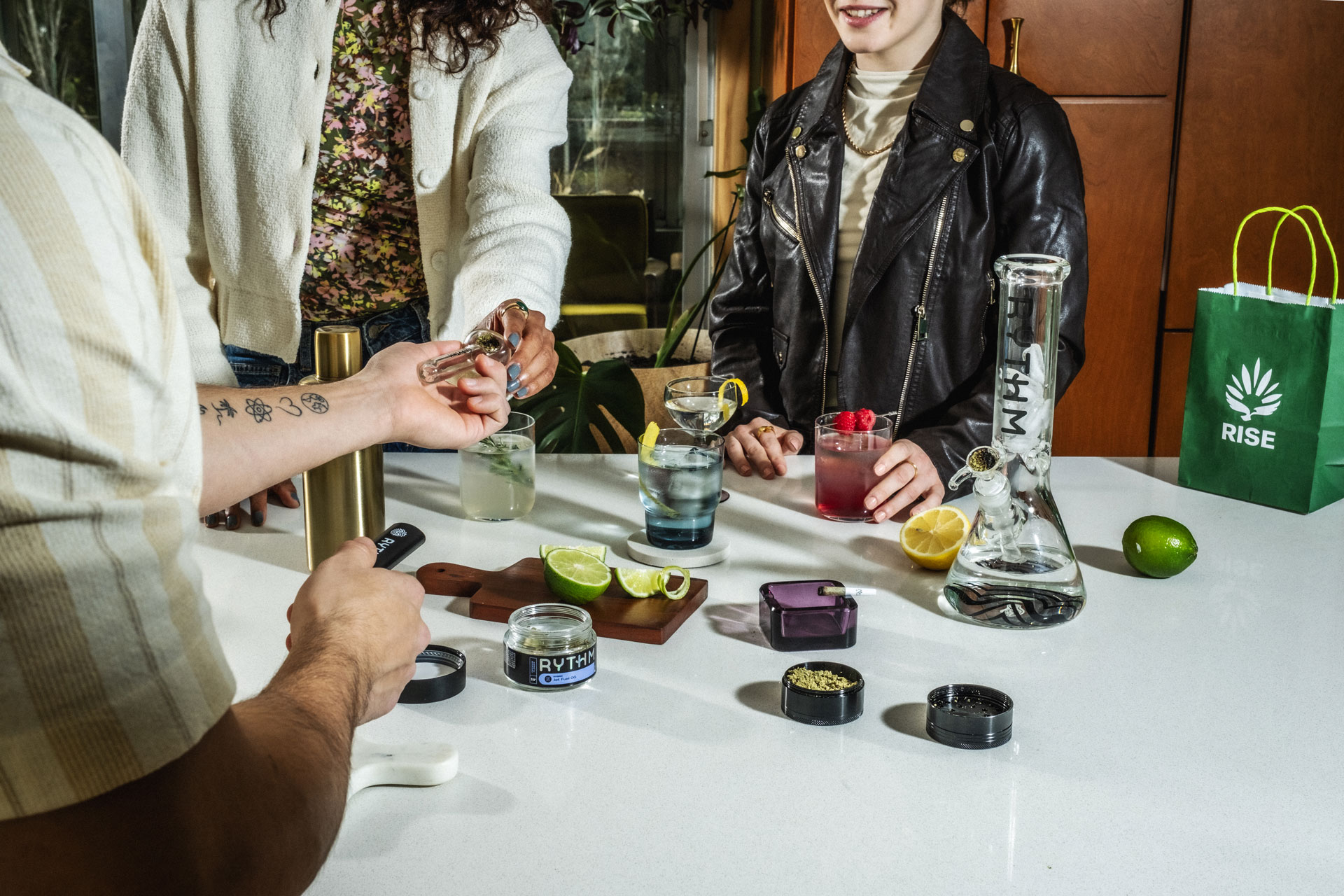
RISE is a US-based cannabis dispensary.
Creatives collaborated on the creation and execution of RISE's rebrand. The challenge was to push the defiant, playful voice across visuals as well as tone.
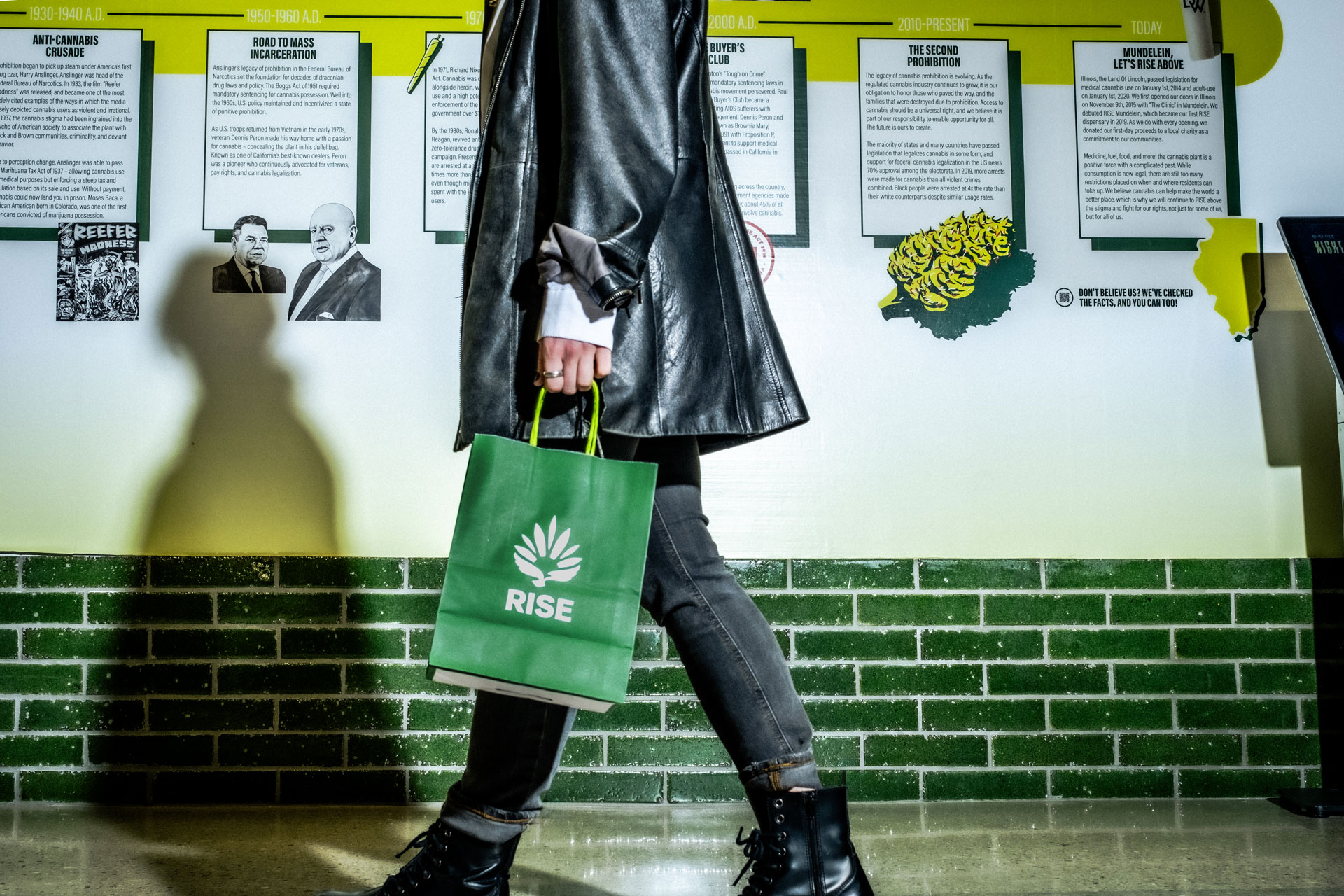
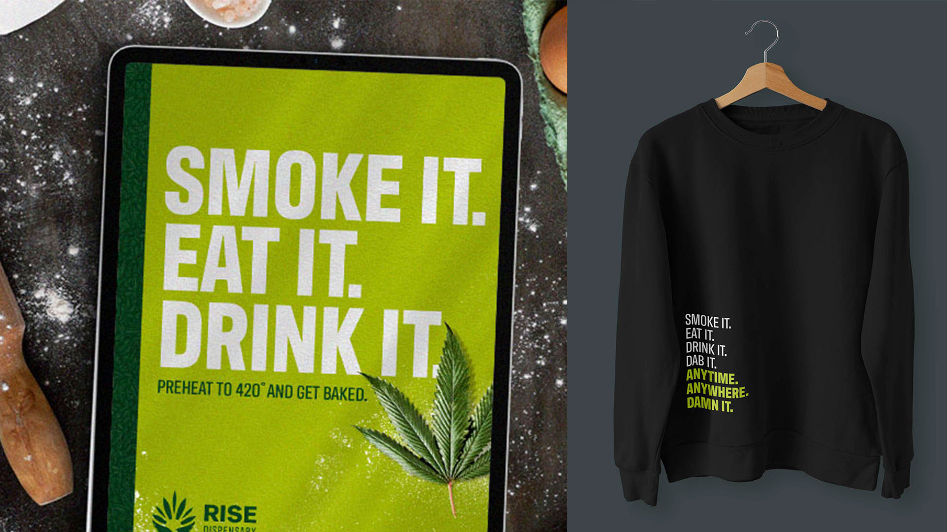
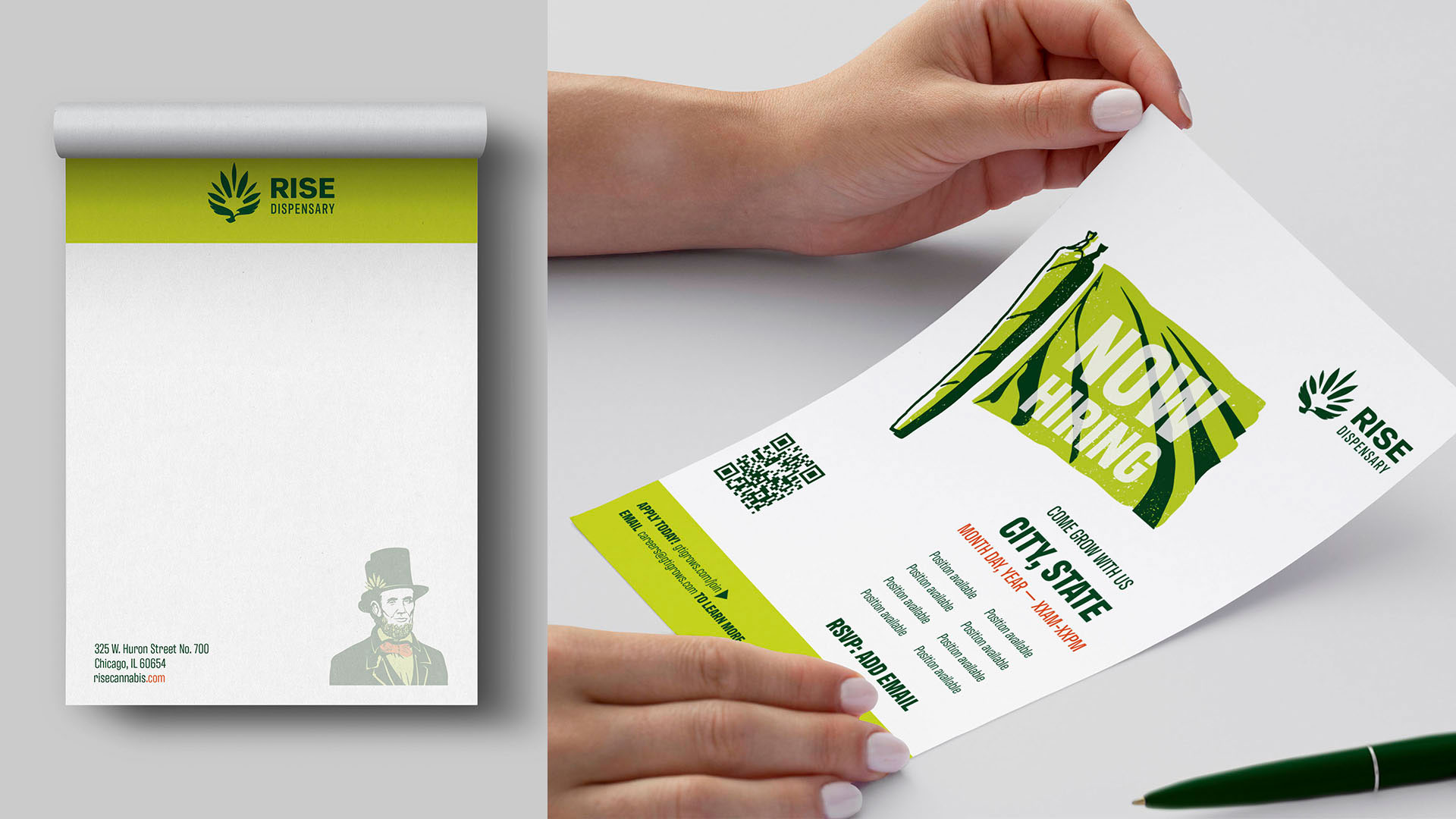
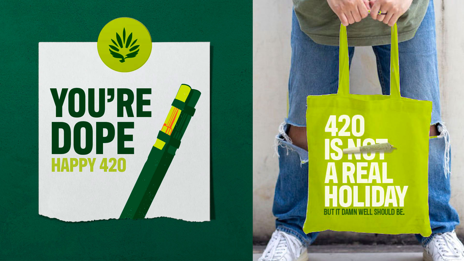
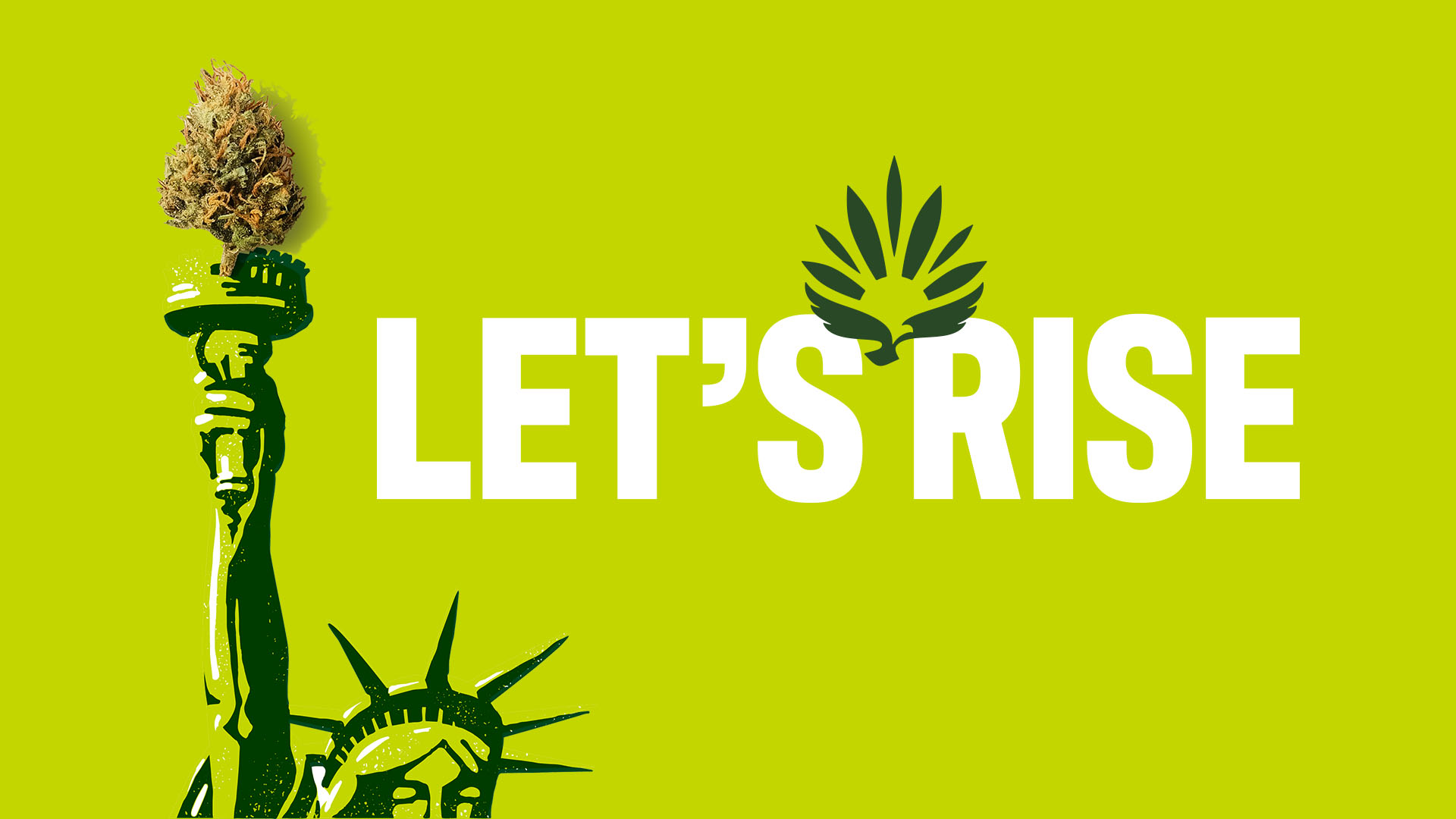
A consolidated color palette was developed from core cannabis colors: kief, leaf and resin. The typeface reinforced the strong, rebellious tone with its increase in height, weight and tighter width. Halftone patterns were applied to headlines and illustrations to tie in to protest culture. The logo itself embraced the spirit of freedom and rebirth with it's inclusion of the bird elevating a cannabis leaf.
Cannabis Clio Awards: Bronze Brand Identity
Creative Team
Oliver Agency and Turner Duckworth