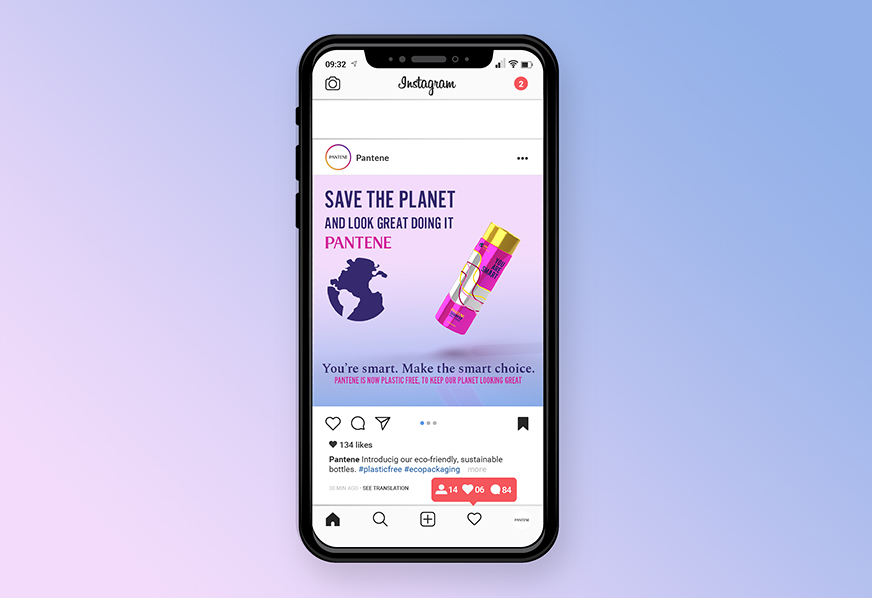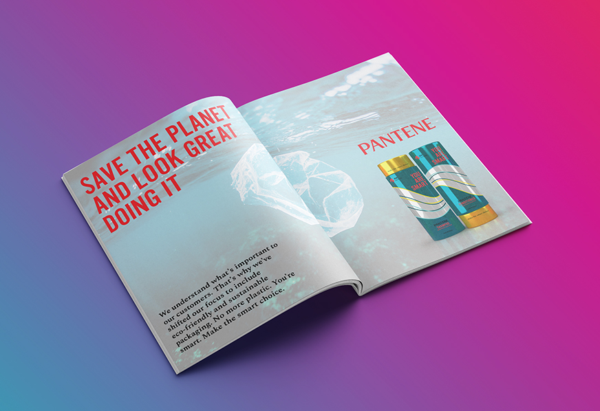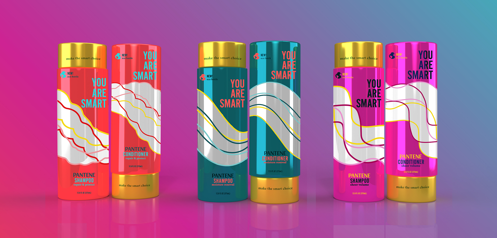
Health and beauty products are filled with a slough of unnecessary, single-use plastic. I use Pantene products daily and realized they're equal culprits of this problem. As a consumer, I find it empowering to purchase products from companies who recognize the importance of eco-packaging, so I decided to redesign Pantene's shampoo and conditioners, with equally powerful visuals but sustainable design.
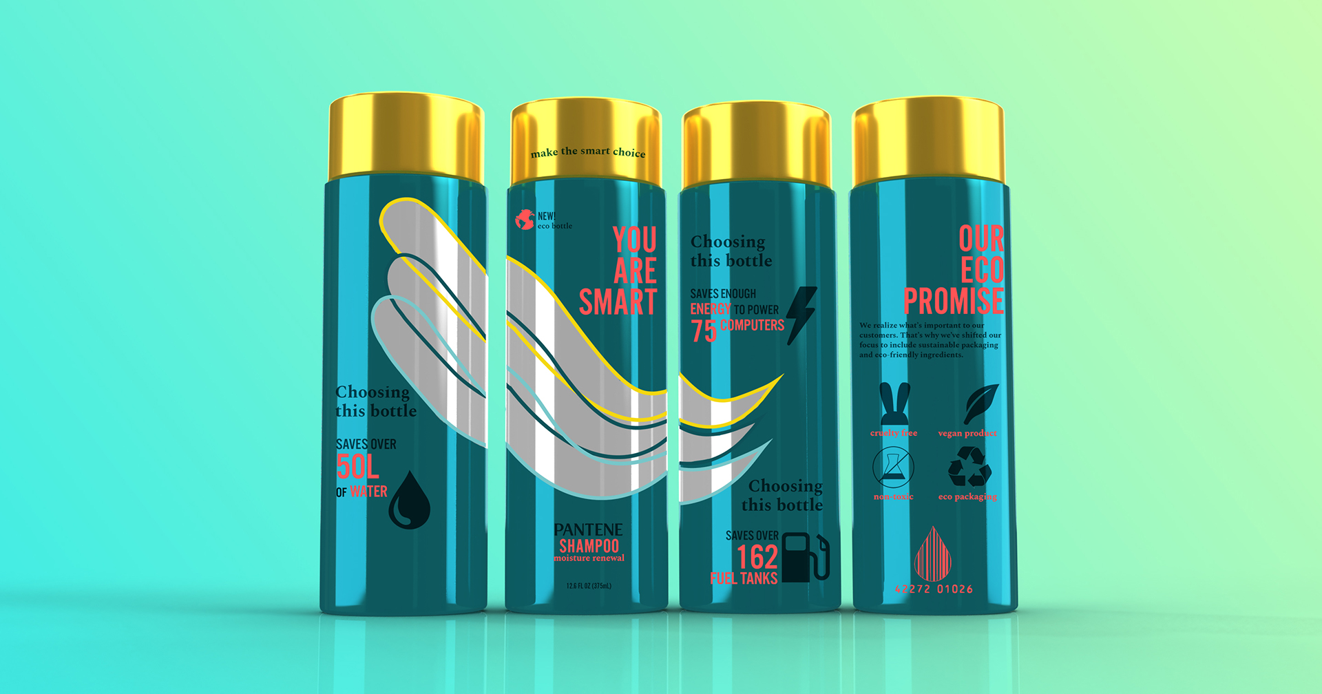
First, I needed to devise how to make the package sustainable. To eliminate plastic, aluminum was used. Aluminum is fully recyclable and takes less water and energy to produce, so there was the added benefit of using fewer resources. To replace the squeeze bottle method previously used, an aluminum twist off cap was implemented. This all made the packaging lighter, so it saved transportation fuel as well.
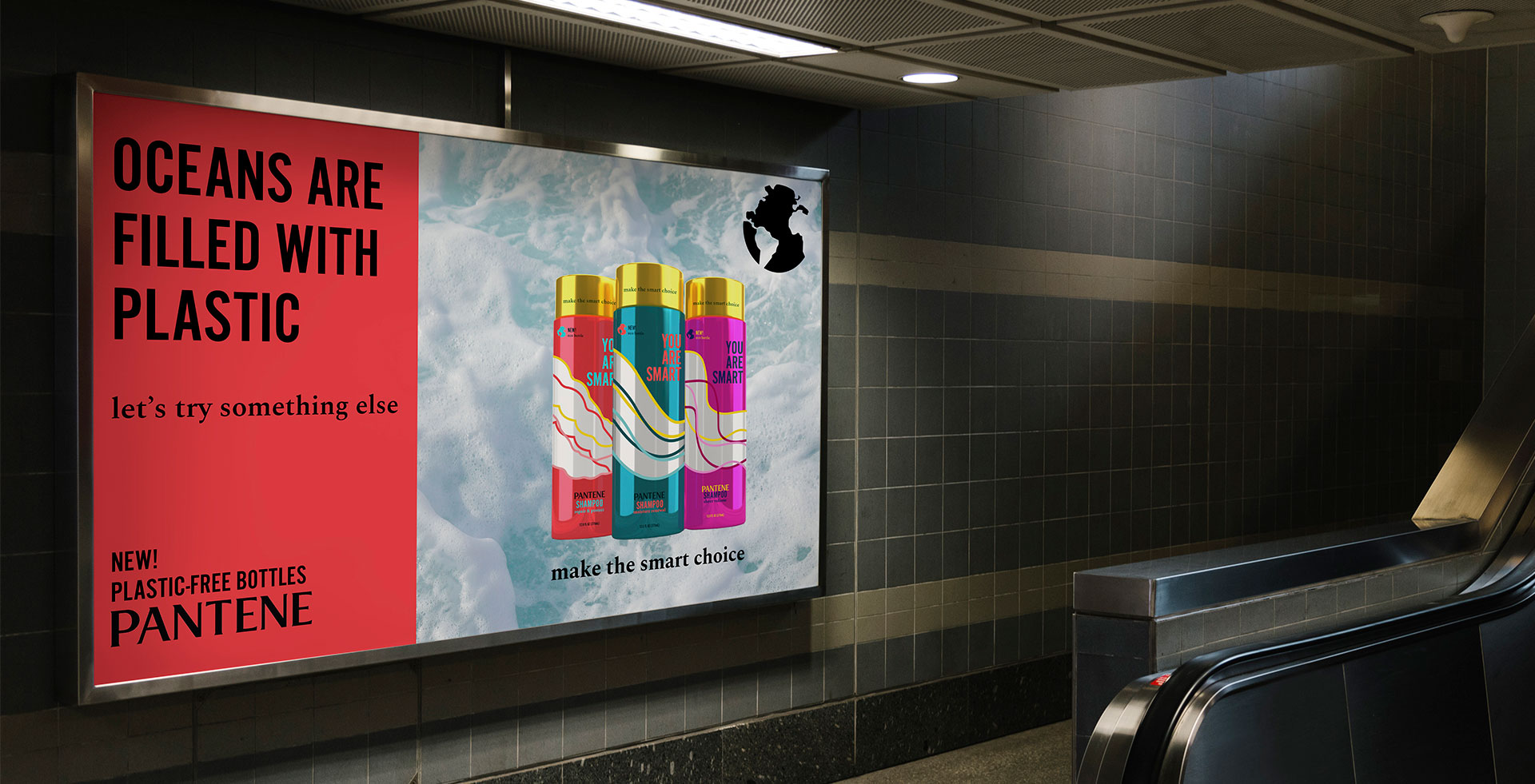
The redesign reflected the message: bold, unapologetic, and feminine. The iconic gold cap was kept to retain the customer base, as well as the company logo. Bright colors demonstrated the impact of the sustainable packaging and empowered the user. Unapologetic language continued this idea. Callouts were placed on both the bottle and in advertisements. "You are smart" became the basis for the campaign, addressing millennial women who are often pegged as superficial users. Instead, the product appeals to their values, empowering them to make the smart, sustainable choice.
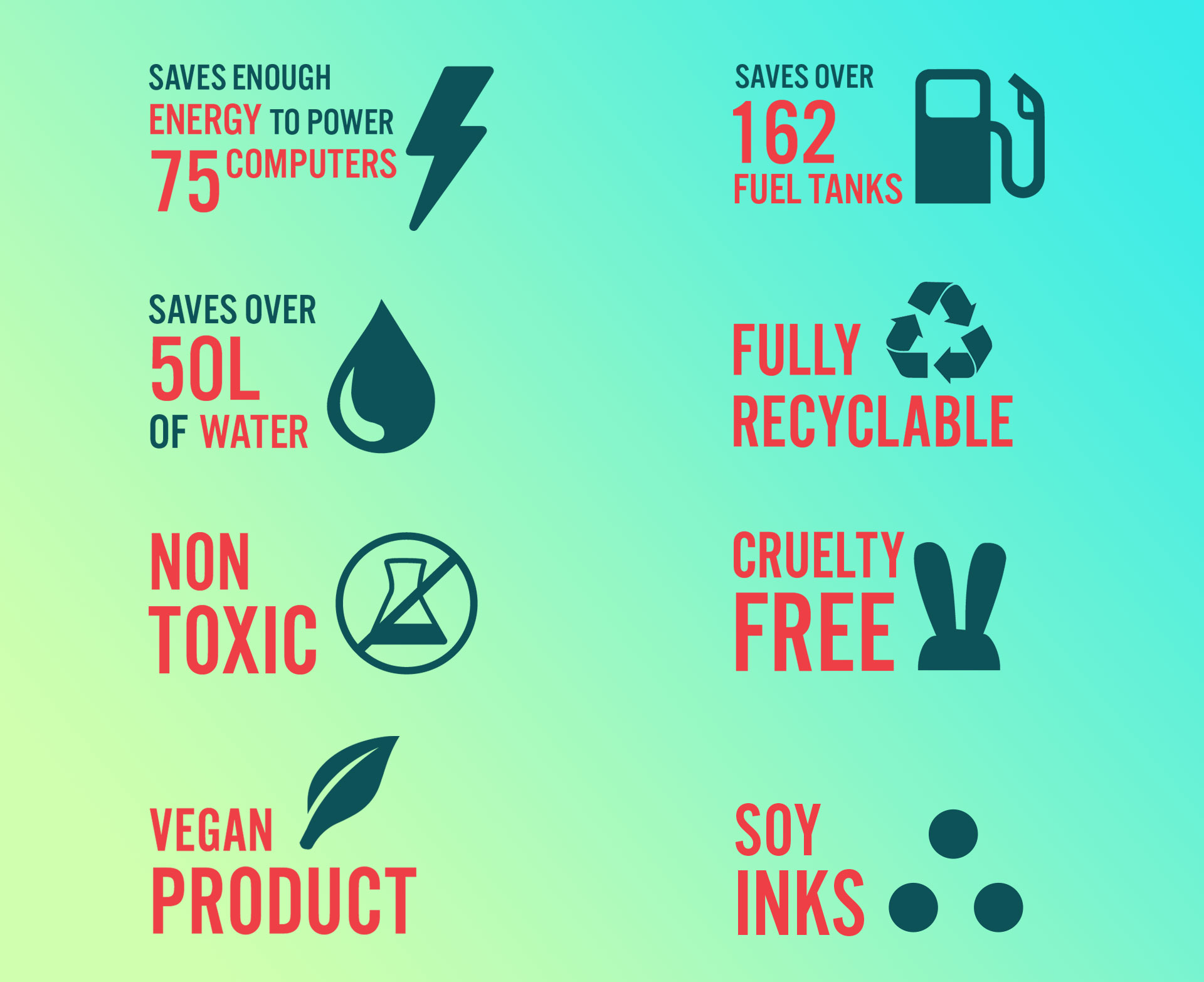
This is the icon system that helps inform the user, wrapping around the various sides of each bottle.