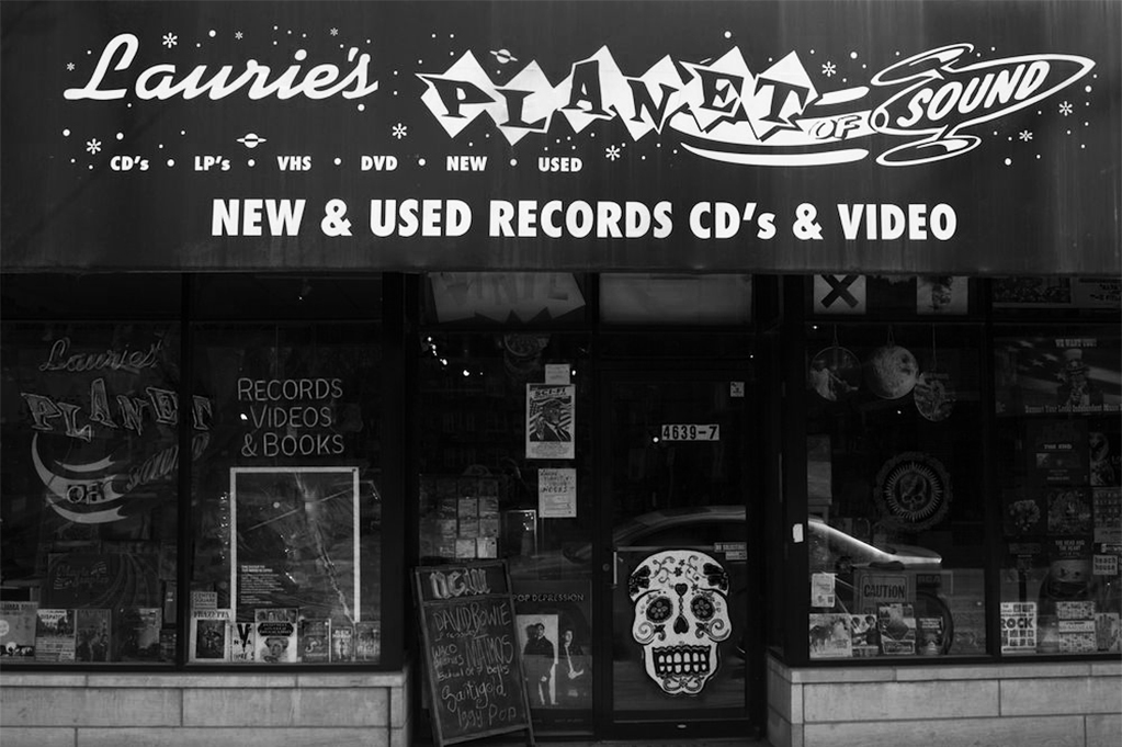
A funky, local shop, Laurie’s Planet of Sound offers used and reproduced records with a strong personality. They’re an unabashed, offbeat brand. Unfortunately, Laurie’s Planet of Sound had an overly complicated logo and brand.
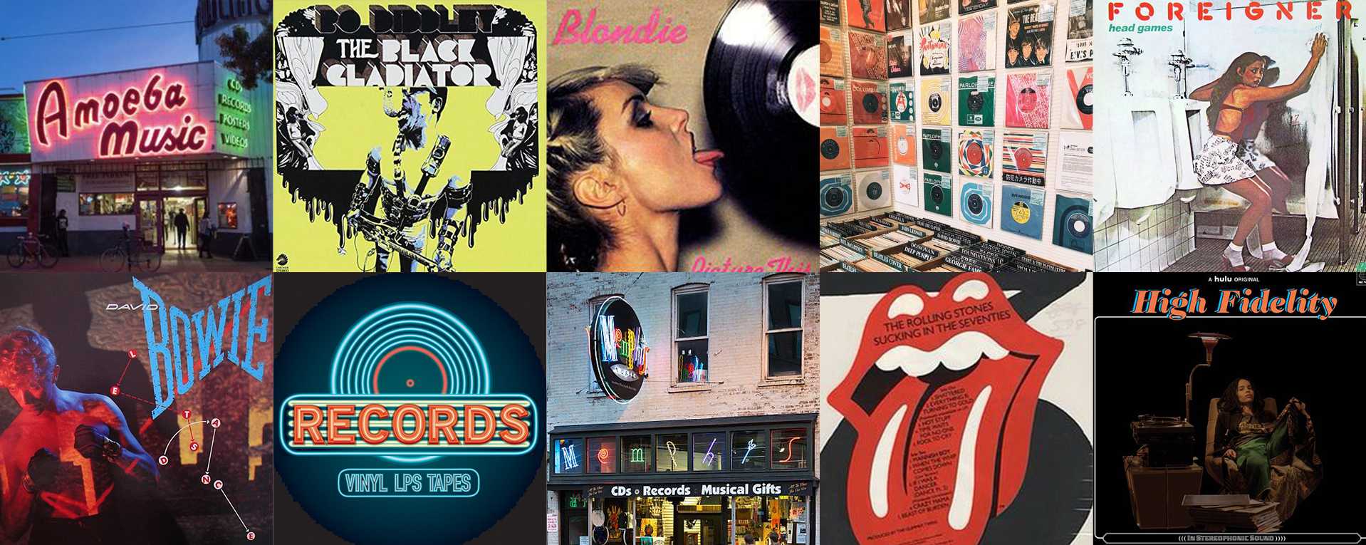
Research was conducted surveying record stores similar in tone, and it was concluded that the shapes of the letterforms should be bold and unusual, similar to 60s-80s rock album art. Neon signs also were clear stakeholders in record store culture, which influenced the color explorations.
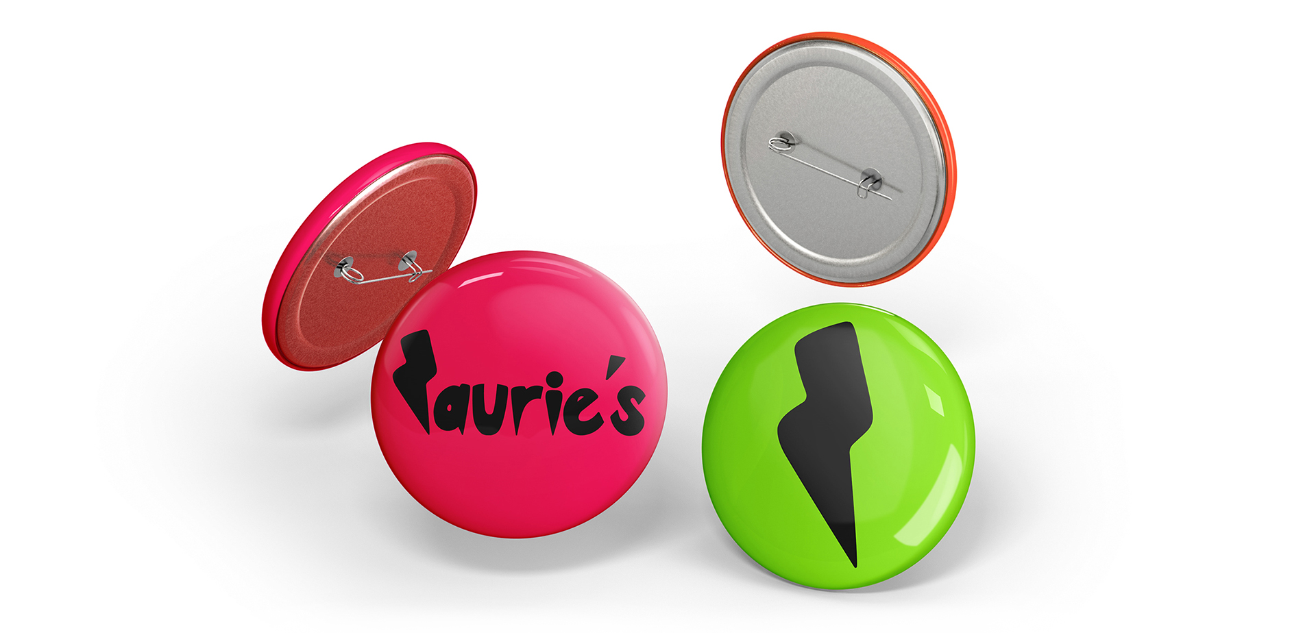
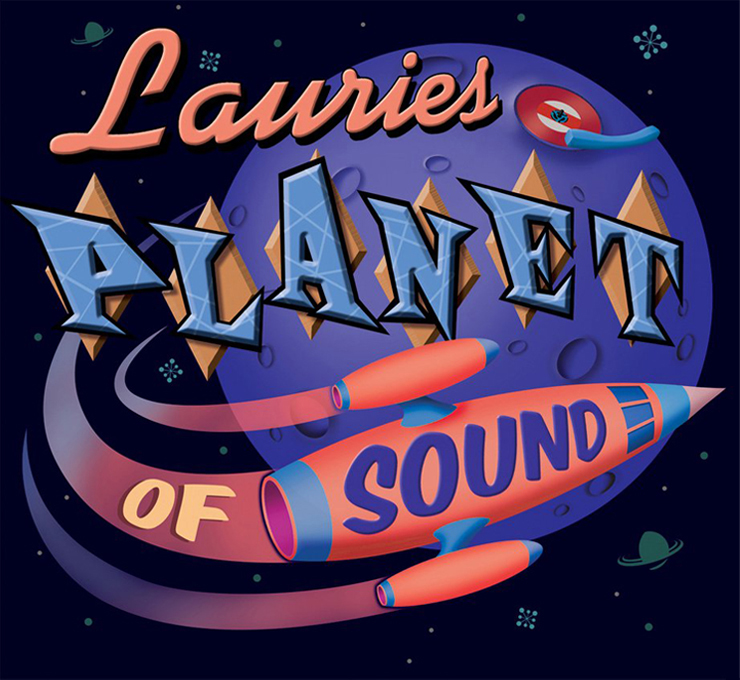
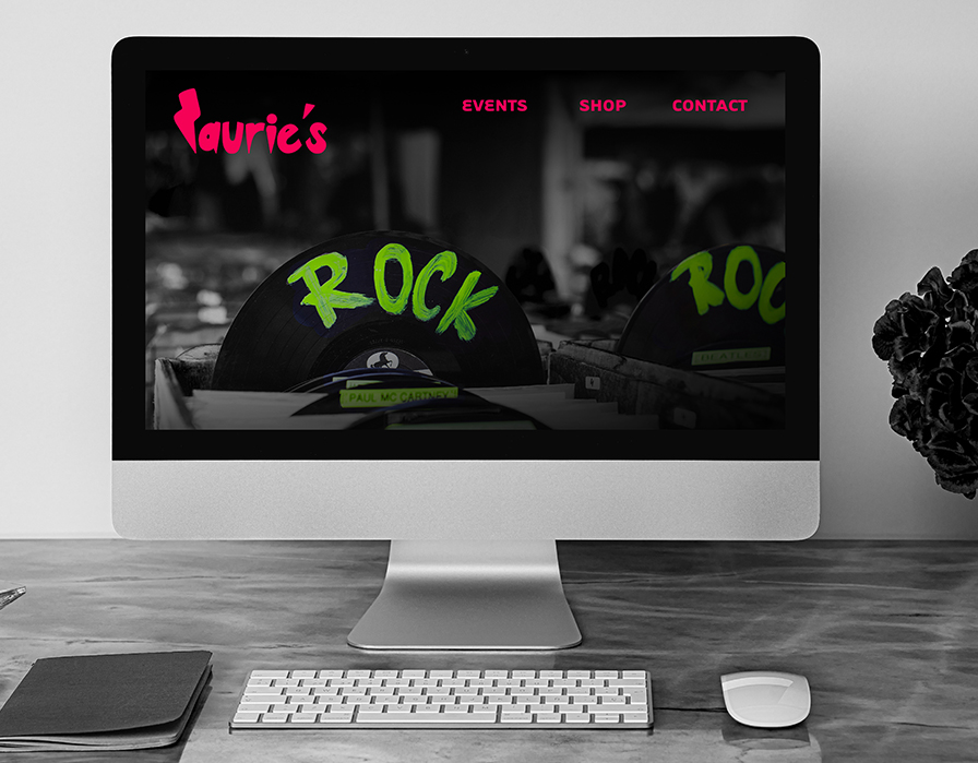
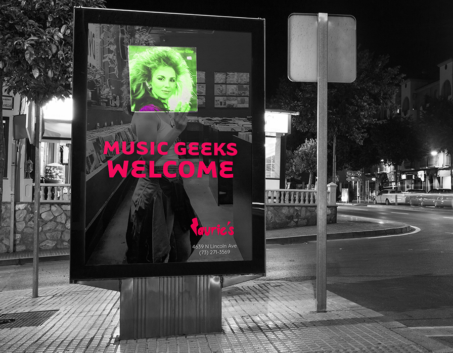
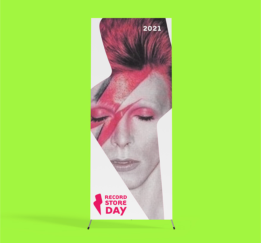
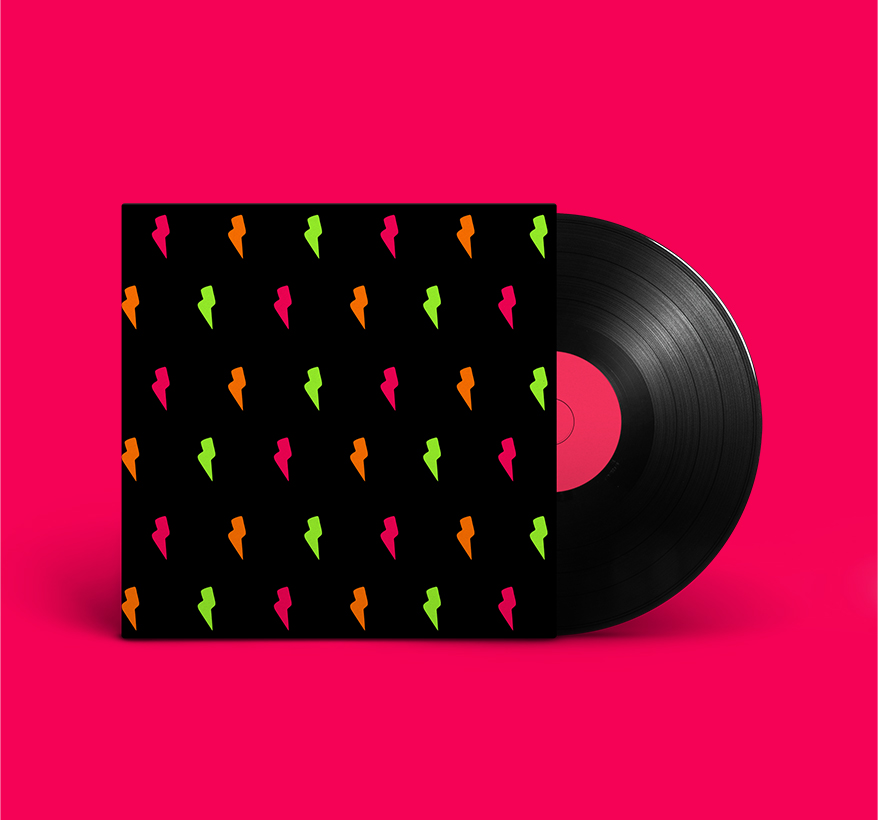
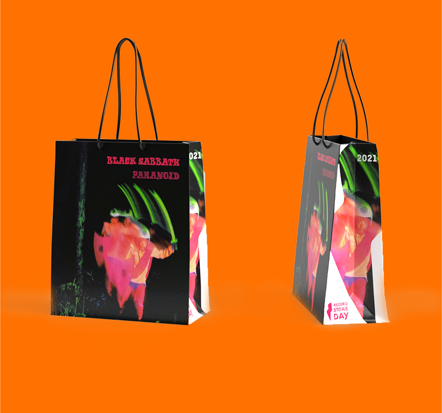
The journey to discover the logo was difficult, until it was decided that only a hand-lettering approach could communicate the originality of the brand. Additionally, the edges of the letters imbued the impression of a needle on vinyl. For typography on brand materials, Tarzana Wide Bold was chosen as the primary typeface, with Quicksand Regular and Medium as the secondary. Both contain unusual quirks and curves, but function for legibility. A powerful pink, derived from neon signage, and a rich black are used as the primary logo colors, with a shocking green and orange serving as secondary colors. Brand photography was treated in black and white with a splash of brand colors. Finally, the secondary logo was chosen to additionally serve as a graphic element. It can break logo rules (such as photographic applications or cropping) to solidify the fun Laurie’s vibe and enable the use of unusual elements and patterns.
The former Laurie's brand.
These images were used as inspiration for the re-brand.
Initial logo sketches.
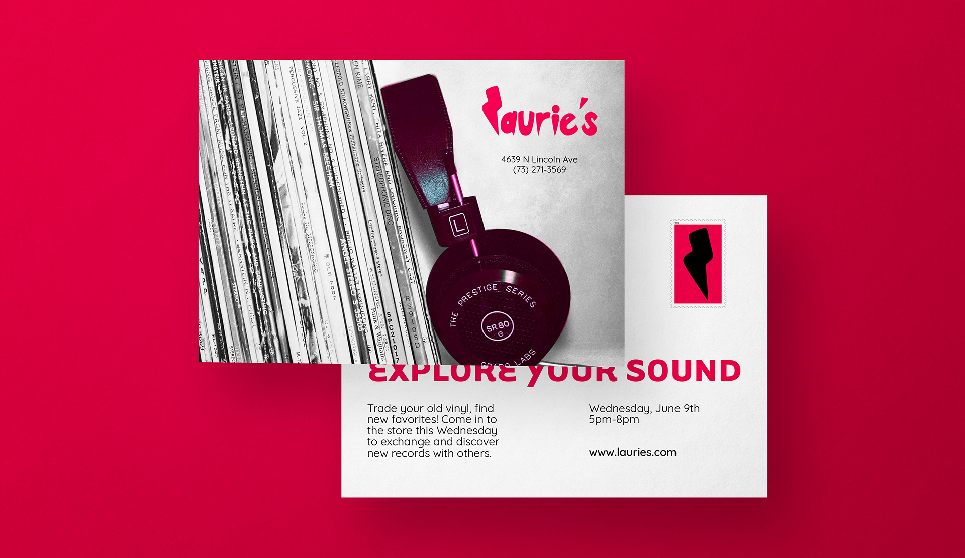
A 4 by 6 inch mailer for a Laurie's event.
The full brand manual can be downloaded here.