
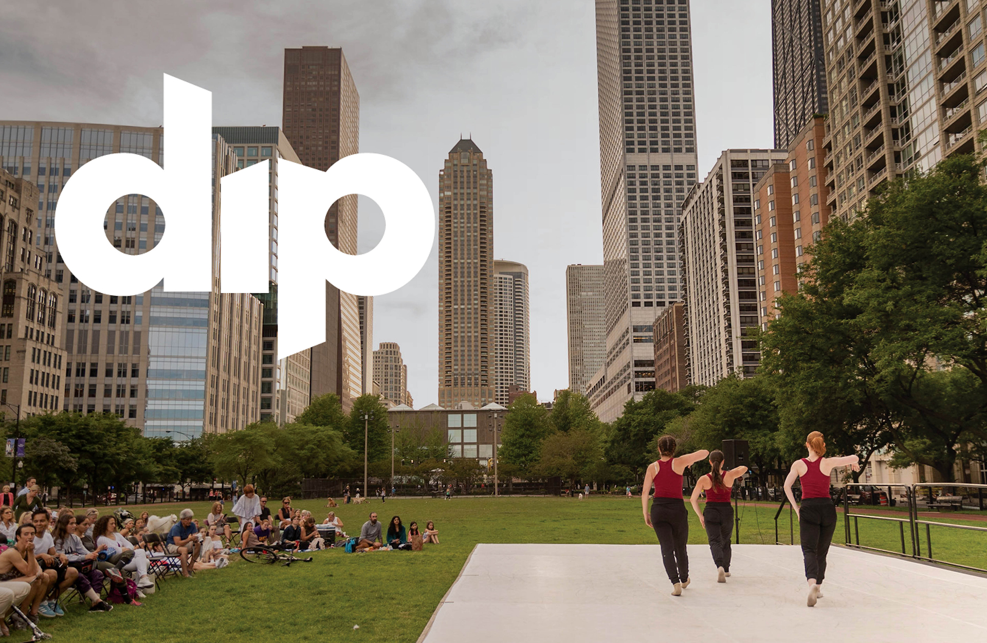
Dance in the Parks is a non-profit dance company, brining free dance performances to parks all around Chicago in the summer.
How do you generate an audience for a performing arts company, in the midst of a global pandemic? This was the objective of Dance in the Parks for the summer of 2020. Pivoting towards an entirely digital platform, attracting new audience members, and retaining existing audiences, all in an entirely new setting.
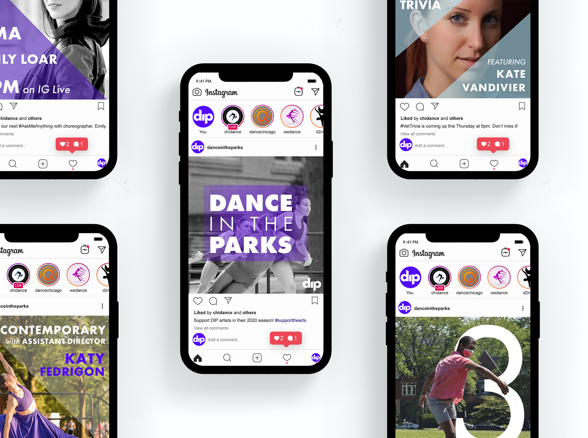
A re-brand was necessary to gain traction virtually. Additionally, we placed emphasis on creating assets for Instagram, as the majority of our existing audience engaged on that platform.
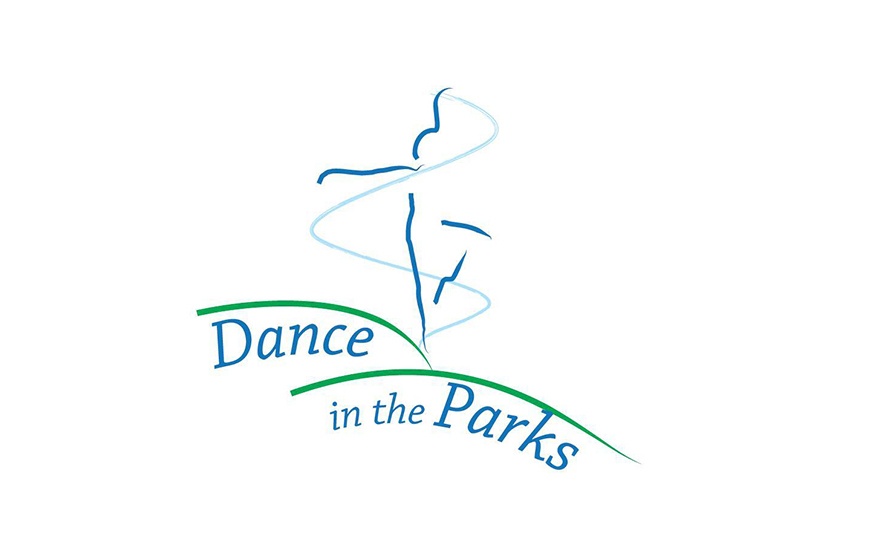
The new logo was created to reflect DIP's voice and mission: collaborative, agile, dynamic, and playful. The primary color was chosen to highlight DIP's energy, and the secondary color stemmed from the original logo. Futura was chosen as the brand typeface to supplement the geometric brand shapes, which framed the photography. These treatments helped to unify a range of content (professionally and individually captured.) Additionally, a system was devised for social media to make each category of content recognizable.
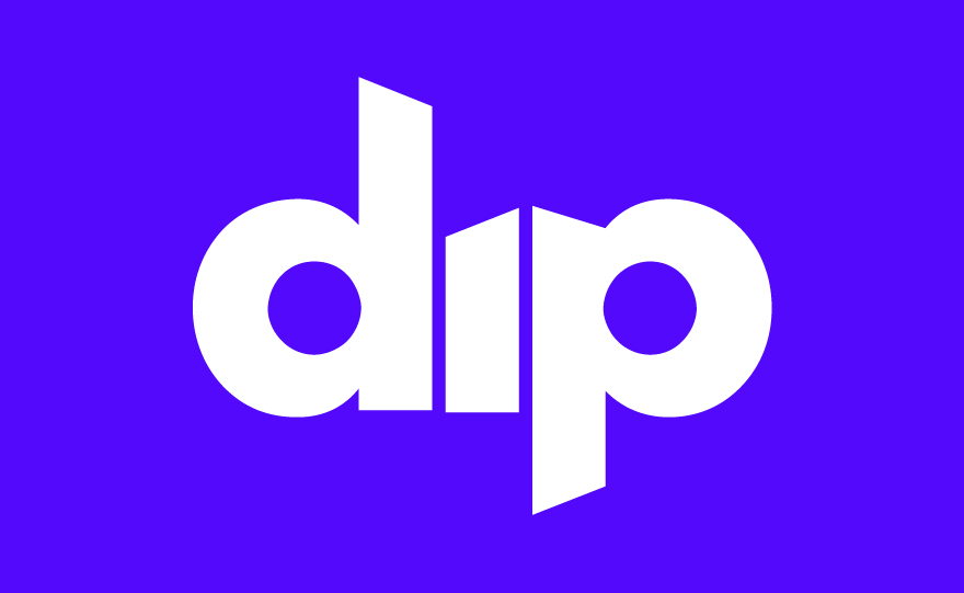
The logo is simple, yet energetic. The angles on the letterforms convey a sense of movement and draw the viewer’s eye across the wordmark. They fit together as if to fit the space, like our agile brand. And to highlight our playful tone, the approachable lowercase letters utilize off-center counters.
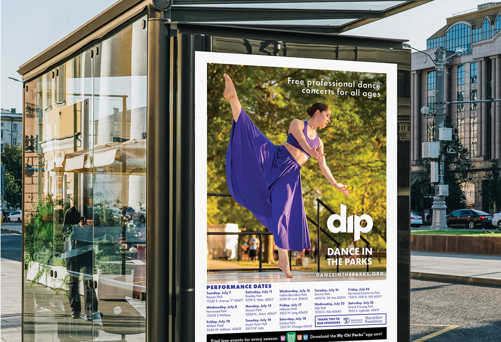
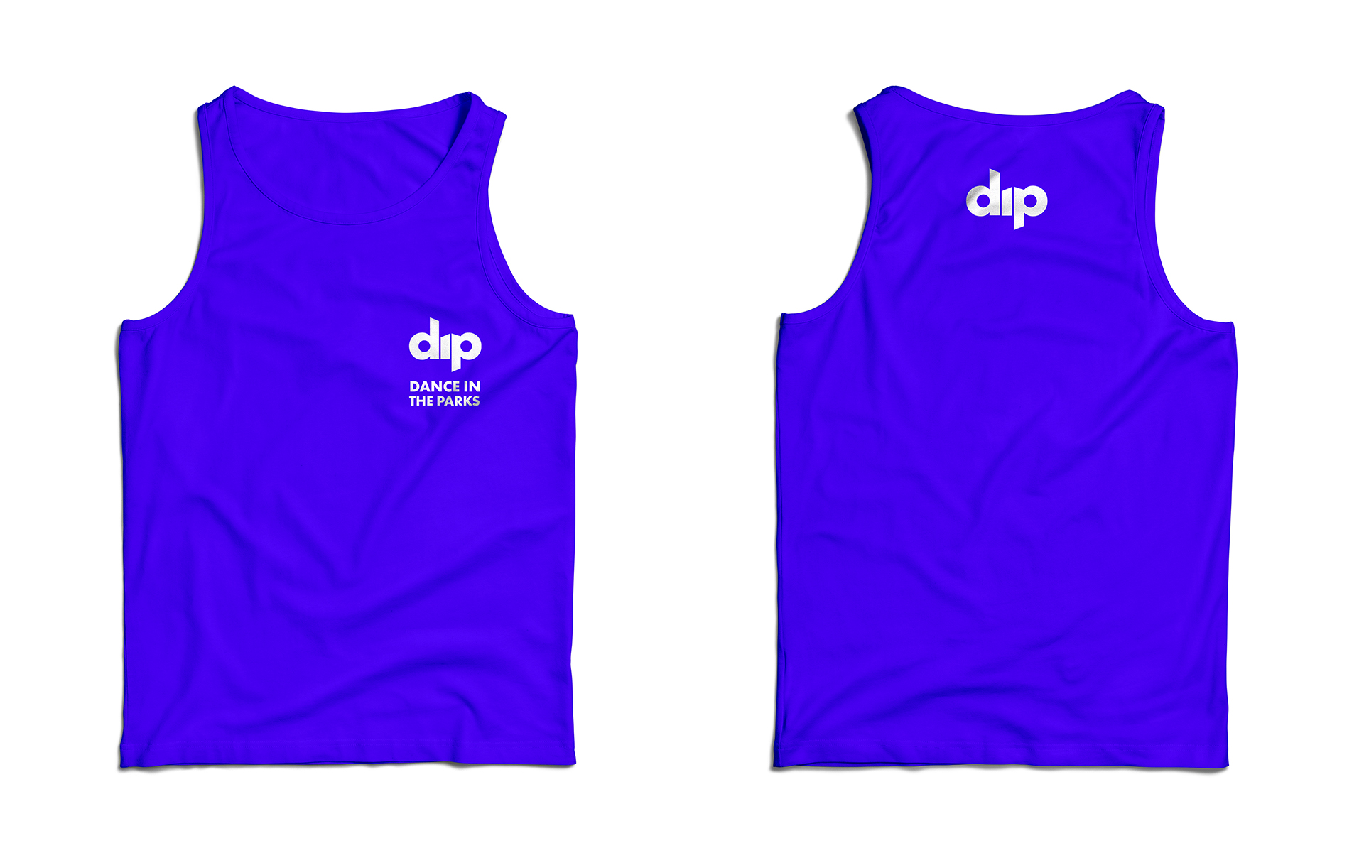
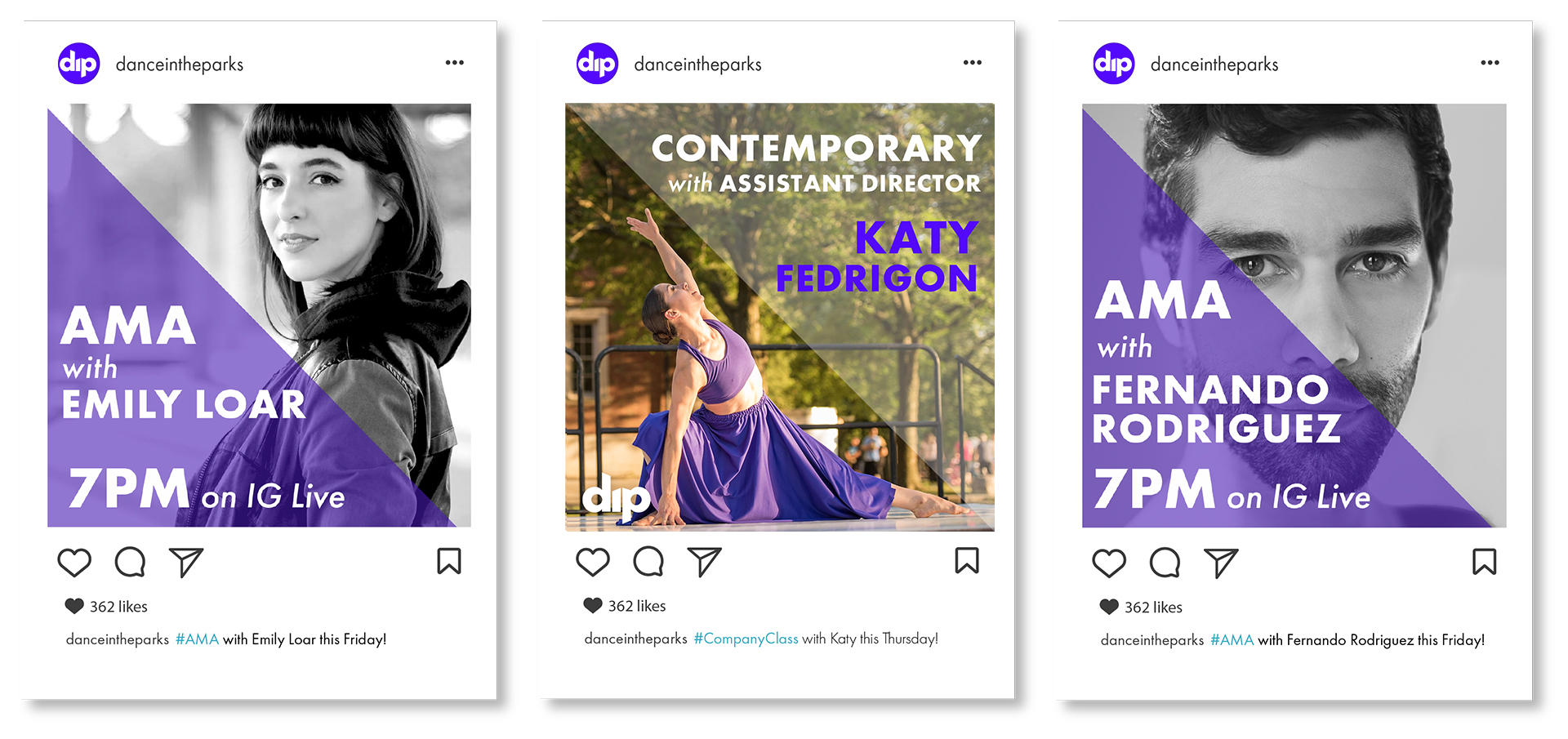
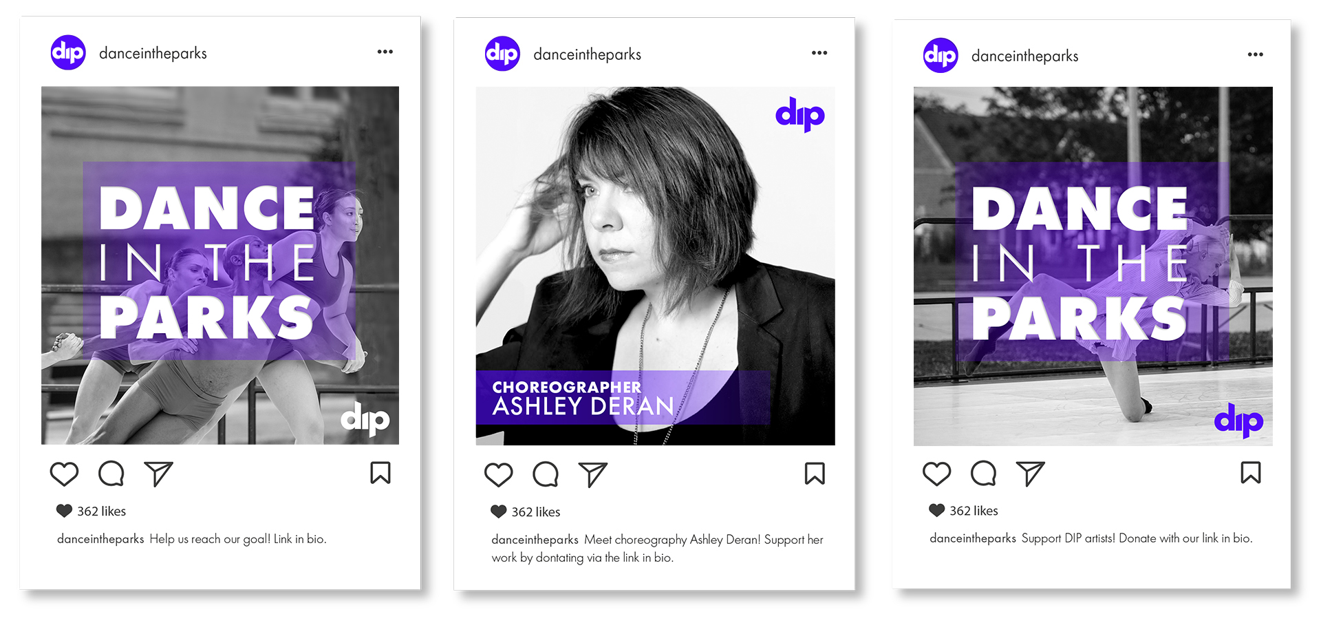
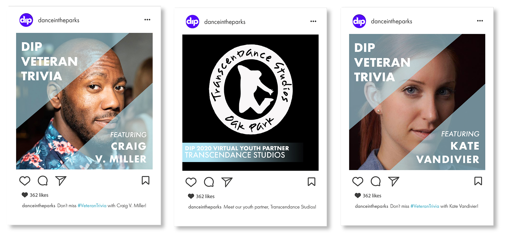
Social media content was a major part of our engagement campaign. DIP’s social media content is divided between three categories, each with distinct looks: primary engagement, secondary engagement, and associated engagement.
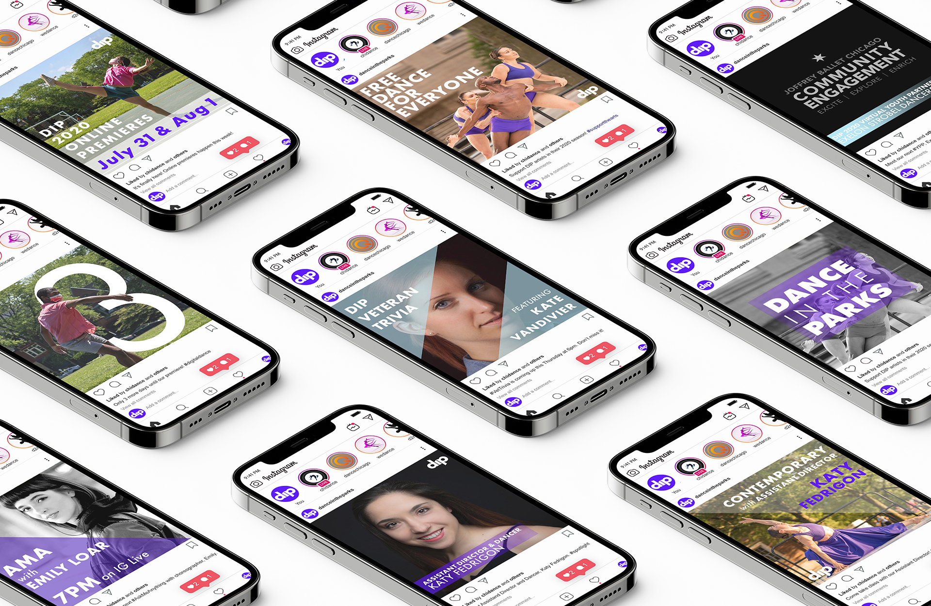
Primary engagement pieces pertained to content created by the company and used the primary colors with triangles for framing.
Secondary engagement included content asking for donations or compensation. These pieces continued to use purple as an accent color, but implemented rectangular shapes for framing.
Associated engagement pieces pertained to posts featuring associated artists and used the company's secondary brand color, a light blue derived from past versions of the company logo.
The full brand manual can be downloaded here.